US Vehicle Accidents Analysis in R
vehicle accidents from 2016-2023
Objective
The objective of this project is to analyze and gain insights from the US road accident data to better understand the contributing factors, patterns, and trends associated with accidents. By examining the dataset, we aim to uncover valuable information that can help in developing strategies to reduce the number of accidents and improve road safety.
Data Processing: Cleaning
Data cleaning is a vital step in an analysis process because accuracy of the analysis depends on the quality of the data. We began data clearing process by removing the attributes that were not required for our analysis such as ID, Airport Code, Longitude and Latitude, Side, County, zip code, Civil Twilight, Nautical Twilight etc.
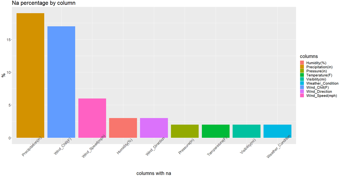
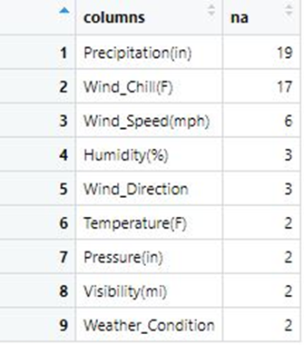
Missing Categorical Values
Handled missing categorical values using two methods:
- Remove all records containing the variables NA value.
- Use NA as new level so other feature information is not lost.
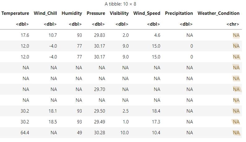
Before we decide, there is one interesting thing: when weather related values is missing, there is a good chance that other weather related variables will be missing too.
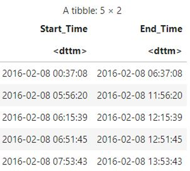
Feature Engineering: Extract new features from existing variables.
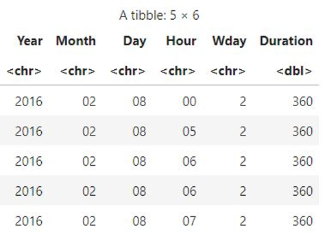
Analysis
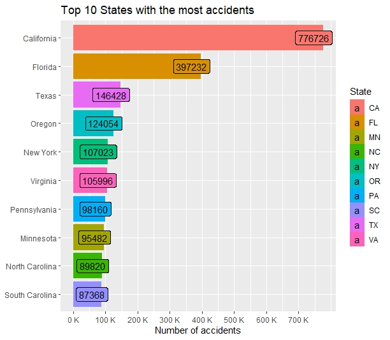
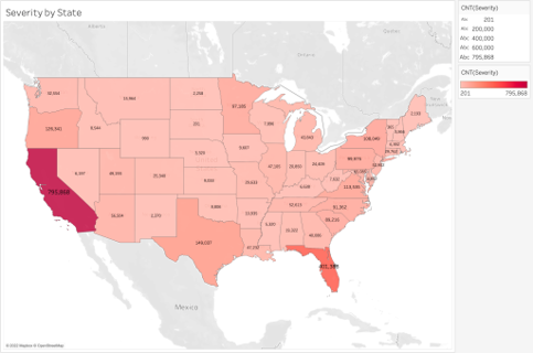
After cleaning the data we found that California had the most data points(~ 770K) and due to computing limiation we decided to analyse only one state but analysis can be extented to other states.
Data Visualizations
Accident by Traffic and Crossing Signal
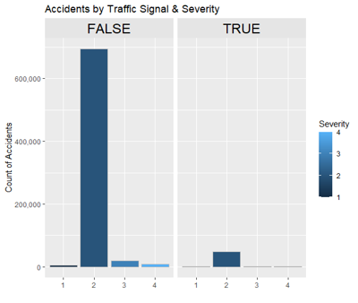
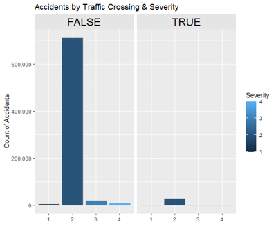
Most accidents occur when no traffic signal or crossing was present which is the most obvious case for accidents to occur.
Accident by Weather Condition
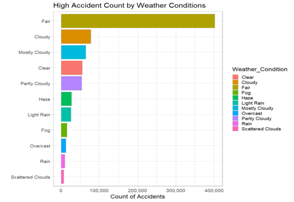
Most accidents occur in fair weather, not bad weather conditions.
Accident by Astronomical Light
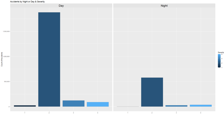
We would assume most of the accidents to happen at night due to poor street lights or poor driving skills but almost 75% of total accidents have occured during daylight as seen from above plot.
Accident by Time of Day
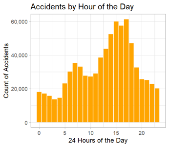
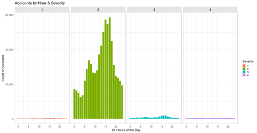
- Majority of Accidents occur between 6-9am and 3-6pm. This pattern strongly suggests that accidents are more prevalent during rush hours. The concentration of accidents during these peak commuting times implies a correlation between increased traffic volume and the likelihood of traffic incidents.
Accidents by Year
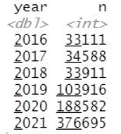
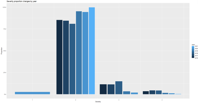
The data shows trends in accidents over these years, with a remarkable surge in the number of accidents from 2019 to 2021, more than doubling from one year to the next. This substantial increase in accidents could be due to various factors such as changes in driving patterns, economic conditions or bad road conditions etc. Additionally, the outbreak of the COVID-19 pandemic in 2020 could have introduced stress or anxieties that might have led to altered driving behaviors, potentially contributing to a rise in accidents.
Accidents Pattern by Month
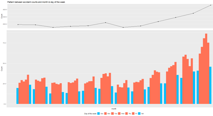
More accidents on weekdays in every month. More accidents occured in the month of December
Word Cloud
Text Mining analysis on Description attribute to transform unstructured data in to suitable structured data for deriving insights.
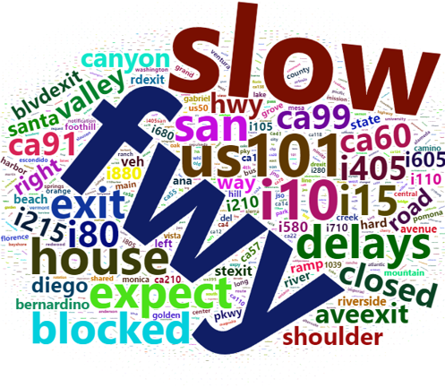
From the word cloud terms like “freeway,” “highway,” “I-10,” and “I-15” in such a visualization might suggest that these roads are frequently mentioned in accident descriptions or reports. It implies that accidents or incidents are commonly happening on these particular routes.
Analysis Conclusion
-
Even after various safety measures implemented by the government, the number of accidents has increased over the years.
-
The popular belief is that the most accidents happens during bad weather like rain and fog, but through the analysis it appears most accidents happened during fair weather.
-
Most accidents happen on the weekdays an hour before and after the typical workday hours. The government could adopt various measure to reduce the traffic flow at that time by promoting public transportation.
-
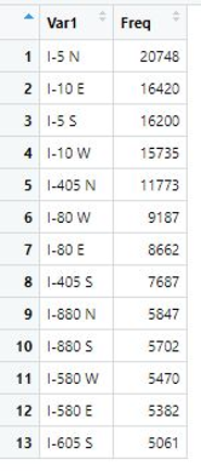
I-5 N freeway in California has the highest frequency of the accidents and California is the state with highest number of accidents
Code
library(tidyverse)
library(scales)
library(lubridate)
library(plotly)
library(gridExtra)
library(tidytext)
library(modelr)
library(caret)
library(ROSE)
library(glmnet)
library(rpart)
library(rpart.plot)
library(randomForest)
library(vroom)
library(e1071)
options(warn = -1)


gc()
cat('.\f')

# Read Data set
df <- vroom("./project/Accidents.csv", show_col_types = FALSE)

drop <- c("ID", "Zipcode", "Airport_Code", "County", "City", "Side", "Start_Lat", "Start_Lng", "End_Lat", "End_Lng",
          "Sunrise_Sunset", "Civil_Twilight", "Nautical_Twilight", "Timezone", "Number", "Country", "Weather_Timestamp")

df <- df[,!(names(df) %in% drop)]

#glimpse(df)
#nrow(df)

# Data Cleaning
df %>%
  summarise(across(everything(), ~ round((sum(is.na(.))/nrow(df))*100))) %>%
  pivot_longer(cols = everything(), names_to = "columns", values_to = "na") %>%
  arrange(desc(na)) %>%
  filter(na > 0) -> na_percentage
na_percentage

options(repr.plot.width=20, repr.plot.height=10)
na_percentage %>%
  ggplot() +
  geom_col(mapping= aes(x=reorder(columns, -na), y=na, fill=columns))+
  labs(x="columns with na", y="%", title="Na percentage by column")+
  theme(text=element_text(size=20), axis.text.x = element_text(angle = 45))


# Rename columns to avoid errors
df <-  df %>%
  rename("Distance" = `Distance(mi)`, "Temperature" = `Temperature(F)`, "Humidity" = `Humidity(%)`,
         "Pressure" = `Pressure(in)`, "Visibility" = `Visibility(mi)`, "Wind_Speed" = `Wind_Speed(mph)`,
         "Wind_Chill" = `Wind_Chill(F)`, "Precipitation" = `Precipitation(in)`)


# Drop weather condition NA Values

glimpse(df$Weather_Condition)
n_distinct(df$Weather_Condition)

df %>% group_by(Weather_Condition) %>% summarise(count=n()) %>% arrange(-count)

df$Weather_Condition[df$Weather_Condition == ""] = NA

df %>% group_by(Weather_Condition) %>%
  summarise(percentage=((n()/nrow(df)) * 100))%>%
  arrange(desc(percentage)) %>%
  filter(percentage > 1) -> weather_conditions_per
weather_conditions_per

weather_conditions_per %>%
  ggplot() +
  geom_col(mapping= aes(x=reorder(Weather_Condition, -percentage), y=percentage, fill=Weather_Condition))+
  labs(x="Weather Conditions", y="%", title="Accidents by Weather Condition")+
  theme(text=element_text(size=20), axis.text.x = element_text(angle = 45))

df <- df %>% filter(!is.na(Weather_Condition))
nrow(df)

# Wind direction
wd <- df %>% group_by(Wind_Direction) %>% count() %>% arrange(desc(n))

ggplot(df, aes(Wind_Direction,..prop.., group=Severity, fill = Severity)) +
  geom_bar(stat = "count", color="grey") +
  labs(x = "", y = "Count of Accidents",
                               title = "Severity by wind direction") +
  theme(strip.text = element_text(size = 18, color = 'black')) +
  scale_y_continuous(labels = scales::comma)

# Handle numeric column NA Values
df <- df %>%
  mutate_if(is.numeric, ~replace_na(., mean(., na.rm=T)))

# Column with na values
df %>%
  summarise_all(~ sum(is.na(.))) %>%
  pivot_longer(cols = everything(), names_to = "columns", values_to = "na") %>%
  arrange(desc(na)) %>%
  filter(na > 0)

df <- df %>%
  filter(!is.na(Wind_Direction)) %>%
  filter(!is.na(Astronomical_Twilight)) %>%
  filter(!is.na(Street))

sum(is.na(df))

# drop <- c("Description", "Street", "State")
#
# df <- df[,(names(df) %in% drop)]
# write.csv(df, './CA_accidents/for_text.csv')

# Feature Engineering from Time Variable
df$year <- lubridate::year(df$Start_Time)
df$hr <- lubridate::hour(df$Start_Time)
df$day <- lubridate::day(df$Start_Time)
df$week <- lubridate::week(df$Start_Time)
df$month <- lubridate::month(df$Start_Time)
df$Weekday <- lubridate::wday(df$Start_Time, label=T, abbr=F)
df$Weekdaya <- lubridate::wday(df$Start_Time, label=T, abbr=T)
df$Duration <- as.numeric(df$End_Time - df$Start_Time)

# which state has highest accidents
drop <- c("Start_Time", "End_Time")

df <- df[,!(names(df) %in% drop)]

states <- map_data("state") %>% as_tibble() %>% select(long, lat, group, region)
states %>% head(5)

states_abb <- vroom("./project/data.csv",  show_col_types = FALSE) %>%
  mutate(State = tolower(State)) %>%
  select(State, Code)
states_abb %>% head(5)

accident_count <- df %>%
  count(State) %>%
  left_join(states_abb, by = c("State" = "Code"))
accident_count %>% head(5)

states <- states %>%
  left_join(accident_count, by = c("region" = "State"))

states %>% select_if(~ !any(is.na(.))) %>% head(5)

# top 10 states
top_10 <- accident_count %>%
  arrange(desc(n)) %>%
  head(10)
top_10 <- top_10$State %>% unlist()
top_10

df %>%
  filter(State %in% top_10) %>%
  count(State) %>%
  ggplot(aes(reorder(State, n), n, fill=State)) +
  geom_col() +
  geom_label(aes(label = n), nudge_y = -30000) +
  labs(x = NULL, y = "Number of accidents",
       title = "Top 10 States with the most accidents") +
  scale_x_discrete(labels = rev(c("California", "Florida", "Texas", "Oregon",
                                  "New York", "Virginia", "Pennsylvania",
                                  "Minnesota", "North Carolina", "South Carolina"))) +
  scale_y_continuous(breaks = seq(0, 700000, 100000), labels = unit_format(unit = "K", scale = 1e-03)) +
  coord_flip()

###########################
# California State
df_CA <- df %>% filter(State=="CA") %>% select(-State)

# Drop weather conditions
df_CA %>% count(Weather_Condition) %>% filter(n < 20) %>% select(Weather_Condition, n)

drop_weather <- df_CA %>% count(Weather_Condition) %>% filter(n < 20) %>% select(Weather_Condition)
drop_weather <- drop_weather$Weather_Condition %>% unlist()

df_CA <- df_CA %>%
  filter(!(Weather_Condition %in% drop_weather)) %>%
  mutate(Weather_Condition = factor(Weather_Condition))

# Group 4 severity levels into 2 levels
ggplot(df_CA, aes(Severity, fill = !Severity %in% c(3, 4))) +
  geom_bar() +
  scale_y_continuous(labels = unit_format(unit = "K", scale = 1e-03)) +
  scale_fill_discrete(name = "Severity", labels = c("Severe: 3 or 4", "Not Severe: 1 or 2")) +
  labs(y = "Count",
       title = "Unbalanced severity levels")
##################################################

df <- df_CA

# Distance Affected by distance
df %>%
  group_by(Severity) %>%
  summarise(prop = mean(Distance)) %>%
  ggplot(aes(Severity, prop, fill = !Severity %in% c(3, 4))) +
  geom_col() +
  labs(
    y = "Average affected distance (mi)",
    title = "More severe accidents tend to affect longer road distance") +
  scale_fill_discrete(name = "Severity", labels = c("More Severe: 3 or 4", "Less Severe: 1 or 2"))

# Accident count in each severity level
df %>%
  group_by(year, Severity) %>%
  count() %>%
  group_by(year) %>%
  mutate(sum = sum(n)) %>%
  ggplot(aes(Severity, Proportion)) +
  geom_col(aes(fill = year), position = "dodge2") +
  labs(x = "Severity",
       y = "Proportion",
       title = "Severity proportion changes by year") +
  scale_y_continuous(labels = percent)

#########################################################################
g_top <- df %>%
  count(month) %>%
  ggplot(aes(month, n)) +
  geom_line(aes(group = 1)) +
  geom_point() +
  labs(y = "Count",
       x = NULL,
       title = "Pattern between accident counts and month & day of the week") +
  scale_x_discrete(labels = c("Jan", "Feb", "Mar", "Apr", "May",
                              "Jun", "Jul", "Aug", "Sep", "Oct",
                              "Nov", "Dec")) +
  scale_y_continuous(labels = unit_format(unit = "K", scale = 1e-03))

g_bottom <- df %>%
  ggplot(aes(month, fill = Weekday)) +
  geom_bar(position = "dodge") +
  scale_fill_manual(values = c("deepskyblue1", "coral1", "coral1","coral1","coral1","coral1", "deepskyblue1"),
                    name = "Day of the week",
                    labels = c("Sun", "Mon", "Tue", "Wed", "Thu", "Fri", "Sat")) +
  theme(legend.position = "bottom") +
  guides(fill = guide_legend(nrow = 1)) +
  scale_x_discrete(labels = c("Jan", "Feb", "Mar", "Apr", "May",
                              "Jun", "Jul", "Aug", "Sep", "Oct",
                              "Nov", "Dec")) +
  labs(y = "Count") +
  scale_y_continuous(labels = unit_format(unit = "K", scale = 1e-03))

grid.arrange(g_top, g_bottom, heights = c(1/4, 3/4))

#########################################################################

# Visualization for CA State

#df <- df %>% filter(!(Severity %in% 1))

#--- Accidents by severity ----
options(repr.plot.width=10, repr.plot.height=8)
ggplot(df, aes(factor(Severity), fill = Severity)) + geom_bar(stat = "count", color = "gray") +
  labs(x = "", y = "Count of Accidents", title = "Accidents by Severity")+
  scale_y_continuous(labels = scales::comma)

#--- Severity by accident count & traffic signal  -----
ggplot(df, aes(factor(Severity), fill = Severity)) + geom_bar(stat = "count", color="grey") +
  facet_grid(~Traffic_Signal) + labs(x = "", y = "Count of Accidents",
                                     title = "Accidents by Traffic Signal & Severity") +
  theme(strip.background = element_rect(fill="grey90")) +
  theme(strip.text = element_text(size = 18, color = 'black')) +
  scale_y_continuous(labels = scales::comma)

#--- Severity by accident count & Crossing  -----
ggplot(df, aes(factor(Severity), fill = Severity)) + geom_bar(stat = "count", color="grey") +
  facet_grid(~Crossing) + labs(x = "", y = "Count of Accidents",
                               title = "Accidents by Traffic Crossing & Severity") +
  theme(strip.background = element_rect(fill="grey90")) +
  theme(strip.text = element_text(size = 18, color = 'black')) +
  scale_y_continuous(labels = scales::comma)

#--- Severity by accident count & Astronomical_Twilight  -----
options(repr.plot.width=12, repr.plot.height=8)
ggplot(df, aes(factor(Severity), fill = Severity)) +
  geom_bar(stat = "count", color = "gray") +
  facet_grid(~Astronomical_Twilight) + labs(x = "", y = "Count of Accidents",
                                            title = "Accidents by Night or Day & Severity") +
  theme(strip.background = element_rect(fill="grey90")) +
  theme(strip.text = element_text(size = 18, color = 'black')) +
  scale_y_continuous(labels = scales::comma)


# ----  No rain and Severity  ------------

options(repr.plot.width=12, repr.plot.height=8)
a <- df %>% filter(Precipitation < 0.01)
# max(a$`Precipitation(in)`)
df %>% filter(Precipitation < 0.01) %>%
  group_by(Severity) %>%
  summarise(n = n()) %>%
  ggplot(aes(Severity, n, fill = Severity)) +
  geom_bar(stat = "identity", color = "gray") +
  labs(title = "No Precipation & Severity") +
  scale_y_continuous(labels = scales::comma)

# -----   Weather Conditions  ----------

df %>% group_by(Weather_Condition) %>%
  summarise(n = n()) %>%
  filter(n > 6000) %>%
  ggplot(aes(fct_reorder(Weather_Condition, n),n, fill = Weather_Condition)) +
  geom_bar(stat = "identity", color="grey") + coord_flip() +
  labs(x = "", y = "Count of Accidents",
       title = "High Accident Count by Weather Conditions") +
  theme_light(base_size = 18) +
  scale_y_continuous(labels = scales::comma)


#--------------------------------------
#####        by day of week      ######
#--------------------------------------

d <- df %>% group_by(Weekday, Weekdaya) %>%
  summarise(n = n())

# ---   Weekday and accident count ------
#pal = brewer.pal(7, "Oranges")
ggplot(d, aes(Weekday, n, fill = Weekday)) + geom_bar(stat = "identity",
                                                      color = "gray30") + labs(x = "", y = "Count of Accidents",
                                                                               title = "Accidents by Day") +
  scale_fill_brewer(palette=("Oranges")) +
  theme_light(base_size = 18) + scale_y_continuous(labels = scales::comma)

# ---   Weekday and accident count by Severity   ------
df %>% group_by(Weekday, Weekdaya, Severity) %>%
  summarise(n = n()) %>%
  ggplot(aes(Weekdaya, n, fill = Severity)) + geom_bar(stat = "identity") +
  facet_grid(~Severity) + theme_light(base_size = 18) +
  labs(x = "", y = "Count of Accidents", title = "Accidents by Day & Severity") +
  theme(strip.background = element_rect(fill="grey90")) +
  theme(strip.text = element_text(size = 16, color = 'black')) +
  scale_y_continuous(labels = scales::comma)

#--------------------------------------
#####        by hour of day      ######
#--------------------------------------

df %>% group_by(hr) %>%
  summarise(n = n()) %>%
  ggplot(aes(hr, n)) + geom_bar(stat = "identity", fill = "orange") +
  labs(x = "24 Hours of the Day", y = "Count of Accidents",
       title = "Accidents by Hour of the Day") +
  theme_light(base_size = 18) + scale_y_continuous(labels = scales::comma)

# ---   hour of the day and Severity ------

h <- df %>% group_by(hr, Weekday, Weekdaya, Severity) %>%
  summarise(n = n())

#cols = c("#FD8D3C", "#F03B20", "#BD0026")
df %>% group_by(hr, Severity) %>%
  summarise(n = n()) %>%
  ggplot(aes(hr, n, fill = Severity)) + geom_bar(stat = "identity") +
  facet_grid(~Severity) +  labs(x = "24 Hours of the Day", y = "Count of Accidents",
                                title = "Accidents by Hour & Severity") + theme_light(base_size = 18) +
  theme(strip.background = element_rect(fill="grey90")) +
  theme(strip.text = element_text(size = 18, color = 'black')) +
  scale_y_continuous(labels = scales::comma)

# ---- by Weekday  --------
df %>% group_by(hr, Weekday) %>%
  summarise(n = n()) %>%
  ggplot(aes(hr, n, fill = Weekday)) +
  geom_bar(stat = "identity", show.legend = F) +
  facet_grid(~Weekday) +   labs(x = "24 hours of the day", y = "Count of Accidents",
                                title = "Accidents by Day & Hour") + theme_light(base_size = 18) +
  scale_fill_brewer(palette=("Oranges")) + # scale_fill_manual(values=pal) +
  theme(strip.background = element_rect(fill="grey90")) +
  theme(strip.text = element_text(size = 16, color = 'black')) +
  scale_y_continuous(labels = scales::comma)

## Impact of weather condition on accident severity
weather <- df %>% group_by(Severity) %>% count(Weather_Condition) %>% mutate(n = n / sum(n)) %>% filter(n > 0.02)
weather <- weather$Weather_Condition

df %>%
  filter(Weather_Condition %in% weather) %>%
  group_by(Severity) %>%
  count(Weather_Condition) %>%
  mutate(n = n / sum(n)) %>%
  ggplot(aes(reorder_within(Weather_Condition, n, Severity), n)) +
  geom_col(aes(fill = !Weather_Condition == "Clear"), show.legend = F) +
  facet_wrap(~ Severity, scales = "free_y") +
  coord_flip() +
  scale_x_reordered() +
  scale_y_continuous(breaks = seq(0, 0.4, 0.05), labels = percent) +
  geom_ref_line(h = 0.1, colour = "red", size = 1) +
  geom_ref_line(h = 0.3, colour = "red", size = 1) +
  labs(x = "Weather Condition",
       y = "Proportion",
       title = "Weather condition does not have a strong impact on accident severity")


# write.csv(df, "after_viz.csv")
## Modeling ##

#Group 4 Severity levels into 2 levels
ggplot(df, aes(Severity, fill = !Severity %in% c(3, 4))) +
  geom_bar() +
  scale_y_continuous(labels = unit_format(unit = "K", scale = 1e-03)) +
  scale_fill_discrete(name = "Severity", labels = c("Severe: 3 or 4", "Not Severe: 1 or 2")) +
  labs(y = "Count",
       title = "Unbalanced severity levels")

# After grouping
df_label <- df %>%
  mutate("Status" = factor(ifelse(Severity == "3" | Severity == "4", "Severe", "Not Severe"),
                           levels = c("Not Severe", "Severe")))
ggplot(df_label, aes(Status, fill = !Status == "Severe")) +
  geom_bar() +
  scale_y_continuous(labels = unit_format(unit = "K", scale = 1e-03)) +
  scale_fill_discrete(name = "Severity", labels = c("Severe", "Not Severe")) +
  labs(y = "Count",
       x = "Severity",
       title = "More balanced severity levels")

df_label <- df_label[,!(names(df_label) %in% c("Start_Time", "Severity", "End_Time", "Description", "Street", "year",
                                               "Weekday", "Weekdaya", "day", "week", "Wind_Direction"))]

nzv <- nearZeroVar(df_label %>% select(-c(Status, Distance)), saveMetrics = T)
nzv[nzv$nzv,]

nzv_cols <- rownames(nzv[nzv$nzv,])
df_label <- df_label %>%
  select(-all_of(nzv_cols))

# Split data
set.seed(88)

df_parts <- resample_partition(df_label, c(train = 0.7, test = 0.3))
train_set <- as_tibble(df_parts$train)
test_set <- as_tibble(df_parts$test)

# sampling
ggplot(train_set, aes(Status)) +
  geom_bar(aes(fill = Status)) +
  scale_y_continuous(labels = unit_format(unit = "K", scale = 1e-03)) +
  labs(y = "Count",
       title = "Unbalanced severity levels")

new_train <- ovun.sample(Status ~ .,
                         data = train_set,
                         method = "both", p = 0.5, N = 90000, seed = 1)$data %>% as_tibble

ggplot(new_train, aes(Status)) +
  geom_bar(aes(fill = Status)) +
  scale_y_continuous(labels = unit_format(unit = "K", scale = 1e-03)) +
  labs(y = "Count",
       title = "Balanced severity levels")

# Decision Tree
model_decision <- rpart(Status ~ ., data = new_train, method = "class")

rpart.plot(model_decision, box.palette = "RdBu", shadow.col = "grey")

test_set <- as_tibble(df_parts$test)
test_pred <- test_set %>%
  mutate(pred = predict(model_decision, test_set, type = "class"))

cm <- confusionMatrix(table(test_pred$pred, test_pred$Status))
tibble("Accuracy" = cm$overall[[1]], "Sensitivity" = cm$byClass[[1]],
       "Specificity" = cm$byClass[[2]], "Positive term" = cm$positive)
cm

x <- data.frame(imp = model_decision$variable.importance)
x

# Naives Bayes
df_train_labels <- train_set[, 15]
df_test_labels <- test_set[,15]

#nb <- naiveBayes(train_set, df_train_labels)
nb <- train(factor(Status) ~., data = new_train, method = "naive_bayes")

# Evaluate the model
predictTest <- predict(nb, test_set, type = "raw")

cm = confusionMatrix(predictTest, df_test_labels$Status, mode="prec_recall")
print(cm)


# random forest
model_rf <- randomForest(Status ~ ., data = new_train, mtry = 6, ntree = 500)
model_rf

predict_rf <- predict(model_rf,test_set,type = 'class')

confMat_rf <- confusionMatrix(table(test_set$Status, predict_rf), mode = "prec_recall")
confMat_rf

precision_rf  <- confMat_rf$table[1,1] / colSums(confMat_rf$table)[1] # TP/P' = TP/(TP+FP)
precision_rf

recall_rf <- confMat_rf$table[1,1] /rowSums(confMat_rf$table)[1]  # TP/P = TP/(TP+FN)
recall_rf

Fmeasure_rf <- (2*precision_rf*recall_rf) / (precision_rf + recall_rf)
Fmeasure_rf

# AUC
#auc_rf <- auc(test_set$Status, as.numeric(predict_rf))
#auc_rf

# Importance
important_rf <- data.frame(imp = model_rf$importance)


# Logistics Regression
log_model <- glm(Status~., data=new_train, family=binomial)
summary(log_model)

predictTrain = predict(log_model, type="response")

summary(predictTrain)

PredictTest = predict(log_model, type="response", newdata=test_set)

# Confusion matrix for threshold of 0.5
# confusionmatrix <- table(test_set$Status, PredictTest > 0.5)
# confusionmatrix
#
# accuracy <- (confusionmatrix[1, 1] + confusionmatrix[2, 2]) / sum(confusionmatrix) * 100
# accuracy

fit_logit <- train(Status~., data=new_train, method="glm", family="binomial")
fit_predict <- predict(fit_logit, newdata = test_set)

cm = confusionMatrix(table(test_set$Status, fit_predict > 0.5), mode="prec_recall")
print(cm)